Covering For Mark Williams, Part 1 – by Athanasios
Happy New Year!
No, this isn’t a scheduled post I’ve accidently published early. Just another reminder that there’s a great big world beyond Britain and the USA that we ignore at our peril.
Here in the Gambia it’s New Year’s Day, as here, like in many countries across the globe, we observe more than one calendar. And yes, we’ll also be celebrating Christmas and the western New Year on January 1st too. You can’t have too much of a good thing!
It’s also winter here. I know you’re all freezing back in the UK and over in the USA and Canada (you may be faring better down under) so I thought it fair I should say I’ve put on a short-sleeved shirt in solidarity with you all. Temperatures are unlikely to rise above 33C (91F) this week, and may drop to the low 70s F by night. But despite these hardships I somehow struggle into my “office” to bring you this latest MWi post.
And what a post!
Not only do we have now have regular slots on Sundays (tech’ stuff) and Wednesdays (reviews) but on Tuesdays we now have covers! Ebook covers, that is, beginning with a four-week series from one of our our resident covert artists, Athanasios, who’ll be taking us through the creative processes involved in putting a cover together.

 Athanasios is the genius behind our Saffina Desforges Presents covers, which we are delighted with. We put forward our own ideas and he came up with something much better!
As we head into 2012 we’re really excited to have the likes of Athanasios and Elizabeth Ann West on board, because the New Year 2012 (Western calendar) will be the tipping point for publishing, when ebooks leave print standing, and the print’s spiral of decline accelerates. And the key reason for that will be enhanced ebooks.
I’ve discussed both here on MWi and over at WG2E about how enhanced ebooks will change the face of publishing beyond all recognition, and whether you welcome or deplore these developments they will happen regardless.
Whether you write straight adult fiction, YA, illustrated children’s book or non-fiction, 2012 is going to challenge and change the way you think about books, both as a reader and a writer.
Over the next four weeks we’re going to ease you all into 2012 with a closer look at the technical and artistic side of ebooks and all matters related, and as we go into 2012 we’ll show you with examples just how much and how fast things are changing.
If you missed the first of Elizabeth Ann West’s tech posts on Sunday be sure to check it out. For today I leave you in the capable hands of Athanasios (who also answers to Tom for those who find five syllable names a bit of a mouthful).
Covering For Mark Williams Part 1
I’m Athanasios, a VERY little known graphic/video artist in dvd/film production and until this summer I had never heard of Mark Williams or Saffina Desforges.
They were brought up when Cheryl Shireman, an online friend told me about their indie publishing success in the UK. She went on to tell me they were putting together MWiDP (Mark Williams international Digital Publishing) a consortium of sorts to publicize and bring together lesser, almost unknown, indie authors alongside big names. It sounded like a great place to be so I joined MWiDP. I’m happy to be part of their imprint in Europe and have enjoyed every experience with Mark & Saffi. It seems like the start of good things. They even respond to my direct email, pleasantly I might add.
My previous publishing experience wasn’t always so bright or pleasant. It consisted of fruitless years trying to find a literary agent or publisher for my Occult/Horror Thriller Mad Gods. It was endless queries and barren or stillborn responses to any effort I put into getting attention from traditional publishers or agents. I decided to publish through Amazon & Smashwords.
I then researched what to do and followed the requisite steps to promote. I joined KDP Forums and Kindleboards and took part in discussions on how to promote indie publishing and get paying readers for Mad Gods. There was also goodreads, shelfari and a whole catalogue of promotional sites I’ve still got on a list somewhere. I was already a part of facebook.
One day in early spring 2011 I joined a fledgling facebook group called Indie Writers Unite! It was and still remains a lively, energetic and helpful bunch of indie authors who are free and open with their help and opinions on anything and everybody. Periodically members of the group posted their covers and asked for feedback, to be honest most wanted praise or just to promote their upcoming release: both valid reasons for posting. I gave my opinion on a number of occasions and I think it improved their covers. I found it time consuming to be explaining in words what was much quicker if I just showed what I would do. So I started just taking their examples, took them apart and put them back together in ways I thought improved them.
I have been in graphics and film production for well past a decade and still pay my bills by pixel and dpi manipulation. I think I’m a credible voice on how to improve any visual element to a work. So when asked I do just that. Some of the work I helped is below in before and after form. The process took me less time than describing it.
Remember: Picture=1000 words.After a few such instances Danielle Blanchard Benson, another fellow Indie Writers Unite! member or IWUer, told me she wanted me to redo her whole line of books: The Beautiful People. I took all the pictures and worked on them in Photoshop so they could be full page, chose fonts and text positioning that made each book look like it belonged together in a cohesive and complete series. The pictures themselves make me think of Swedish Erotica, the old, 1970s pulp porn movies so that’s what I emulated.
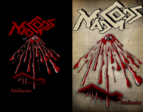
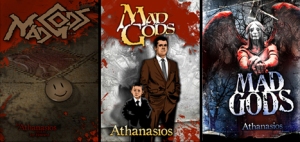
I experimented with different covers for Mad Gods. I began with my own version of the believed symbol of the Illuminati, a mysterious cabal of history linked to Satanism and Global Elite. I changed it to subtle represent the key characters of Mad Gods: Kostadino and his adopted son Adam. Kostadino is a descendant of Byzantine Emperors depicted by the worn and faded double-headed eagle and his cause is as lost in history as the relief floor sculpture. On top of that is the plastic covered, tin happy face button that depicts Adam who is infatuated with shows, movies, music and news. The fact that Adam is the Antichrist is subtly shown with the stereotypical symbols of Satanism on this contemporary cultural symbol.
I enjoyed doing covers so much that I decide to do one for every chapter in Mad Gods. After finishing all 22 chapters I included them in a limited version of the full Mad Gods on ebay. I used an illustrative style that I thought was evocative of the story.
This then prompted me to change main Mad Gods cover to suit the rest of the illustrated chapter heads. I used the same illustrative style with Kostadino and Adam standing enigmatically before a wall covered by the horsemen of the apocalypse.
As much as I enjoyed and loved this new cover it was short lived because it did not help sales. I looked at it critically and concluded it made Mad Gods look like a comic and not the Occult/Horror Thriller I intended. Another revision came with the current cover that shows the skewed and twisted life Adam was saved from by Kostadino. The current cover now better reflects the true nature of the story: the terror and fractured sensibilities Adam is fighting to come to terms with.
This week I shared how I started making covers. Next week I’ll go into the steps in making a cover for authors. I describe the machinations involved in giving them what they want.
I’m always willing to help with indie authors with their covers. More examples of my work are @: Covers For Hire or email me @: mad-gods@videtron.ca.
Athanasios, thank you very much.
I have the advantage of having seen the forthcoming posts, and can promise you some fascinating insights into what goes into the cover design process. Makes sure you’re back here next Tuesday for the next instalment!
But dont stay away from MWi meanwhile. Tomorrow is Review Wednesday and Thursday sees the official announcement of the release of Anne R Allen’s latest book, Sherwood Ltd., though the eagle-eyed among you will have spotted it’s already live on Amazon.
I should also add Athanasios is not the only cover designer working with MWiDP, and we also have several authors who design their own covers with fantastic results. We’ll be exploring them all over the coming weeks and months, as MWi and MWiDP take on a whole new look into 2012. Watch out for more news on that soon!
Meanwhile, if you’re impressed with Athanasios’s work come along and say so. Remember, you can always call him Tom if you can’t spell Athanasios!


Great post Athanasios/Tom, can’t wait to read the next one!
Well worth waiting for!
Athanasios is such a cool name – and forgive me for sounding like a complete ignoramus when I say I’ve always been both astounded and terrified by the illustrative industry (doesn’t help that my own artistic talent is nil). The thought of trying to make something so enigmatic and enticing as a book cover, whilst trying to work in so much about the story sounds … well, like climbing Everest with a blindfold on, to me!
Awesome post – looking forward to hearing more from you! 😀
Perfectly summed up. Ms Charley!
That’s some cool stuff! :}
But I have one question: How do you pronounce Athanasios?
(cause if I can’t pronounce it I have no hope of spelling it, and I’d like to make the effort before I give up and just call you Tom.)
:} Cathryn
The “A” is like when you’ve discovered something as in ah! and so are the rest of the “a’s”. The “th” is a soft th not like in “the”, but like thorough. The “si” is like see and the os sounds like verbose. The previous explanation of how to pronounce my given name is why everybody uses Tom, even those that decided Athanasios would be a good name for me. Don’t get me wrong I like it too but it’s kind’a difficult for “Xenous” non Greeks to pronounce.
That makes perfect sense to me. Athanasios… oh got that right on the first spelling try. :} (That is an acomplishment fro me. Just ask Miriam. I mess up her charcter names all the time *emabrased blush*)
(She’s not exaggerating. It took months for her to realise that Kian wasn’t Kain. And she still calls our friend Charley ‘Charlie’ a lot, ha ha ha. *grin*)
I love these colours. We have an old-ish version of Photoshop on our school computers that I’ve used in the past – I don’t have it at home. I look at some covers and I think, “I could do that better.” (I couldn’t. I tried.) And I know that you shouldn’t judge a book by its cover, but quite often I do.
Greetings, Athanasios!
Happy to share a week of debut with you! I am one of the first to say despite my technical skills, when it comes to graphic arts, I might as well be finger painting. I can make logo and buttons in GIMP, but I lack the education and experience to wield some of the finer powers that software has. It’s on my to-do list to conquer. 🙂
I do find design fascinating. I read Massimo Vignelli’s Canon early on in the process of writing CANCELLED. http://www.vignelli.com/home/bookmagazine/canon.html It was fascinating for someone like me with a limited design education. I had no idea about theories on layout, and what those weird paper sizes A4 etc were based on. I live in a country with the horrifically ugly 8.5×11″
Can’t wait to read more next Tuesday!
Yes, without Tom’s added help, I wouldnt have found that last missing element to my cover for Thunderhead. So glad I asked for his opinion! Hiring Tom for your next book will be money well spent!
What an exciting team Mark is getting together. Your skills are awesome Tom, er, Athanasios. (What I need to know is where to put the accent. Is it A-THAN-as-ios or A-than-AS-ios.) It sounds very mystical in any case.
Very interesting to see the process you went through with Mad Gods. The final one is beautiful and really gets that sense of the macabre across. Love your Saffi Presents cover and Danielle’s covers too.
Welcome.
LoL, put the accent on the AS. I couldn’t have made that up if I tried. That’s too funny, the accent on my name is on the AS. Thanks Anne.
Tom’s doing a cover for me currently — the rough was amazing, and I can’t wait to see what the final draft will look like! Awesome post, Tom 🙂 You’re a seriously talented cover artist.
Athanasios,
I’m coming a couple of days late, but I love the art. Impressive covers. They are intense. In the indie world cover art is so important. Indie’s are going against each other in competition for sales and the cover art has to stand out. Yours definitely does. I paint, but have technical skills when it come to graphics. A good cover artist is worth their weight in gold. It’s the first thing a reader sees, and is most likely attracted too. The rest is up to the author, by way of writing a fantastic story to match the cover art.